Monday 31 January 2011

Typography

To start working in the area i want to go to in uni i have started to work with typography, ive enjoyed it so far so i am interested into making it more relavent to my own work.


The Picture above is a photo of my sketch book, i firstly traced different typefaces out and then worked with photoshop to play around with quotes. 


 The above picture is another picture of my sketchbook, i decided to take typography further by adding quotes or words into the pictures i had taken. I used photoshop to add some ripped paper onto the image, then added text and cut the text out form the white paper so you can see through the text to the image.

This is one of the pictures enlarged, i changed the opacity of the white paper to you can see what is behind it.

Friday 21 January 2011

Resin

Resin was really one of the main influences that lead me onto the style of work I'm doing now. The idea of layering things up works really well, and I've used it to create different things. 

The latest resin piece i have done is this :


I chose to do it in Three layers, a picture facing the bottom, the same picture face the other way and then some railing i had edited on Photoshop. This way you would be able to see what images was actually behind the railings clearly if you just turned the resin over.

The Pictures I used are:


Thursday 20 January 2011

HUHH

This is the second photo I've made using Photoshop. I have used the "To Let" sign on top of a building in Bath to juxtapose different ideas.


I purposely cut the hole out in the center of the sign so you could see through to the building, i really liked this idea as is like your looking at a sign that displays the information for an industrial warehouse and then when you look through, your actually looking at a old high class building in Bath.

After finishing it i printed it off so i could draw from it. I firstly used a ruler to make sure i got my perspectives right and then worked on everything else. I find this way of drawing really helpful and it makes sure everything is in perspective and the right size.

Monday 17 January 2011

Barnacle & Withybrook

To get more photos for my project and to start getting used to my camera I went out to Barnacle Village. The country lanes a very impressive and even though it was a dull day i still managed to capture some really nice photos. 
The Following pictures were edited with Photoshop.


Decided to start Practicing some close up shots, its not something that I've been confident with so I'm not great at it but we've all got to start somewhere i guess?


For the next ones i played around with the contrast a little to make areas more defined and eye catching. I specifically like these ones because the road almost acts as a path for the eye to follow.


Multi Media

I wanted to start working on a larger scale so this peice is A1. I used acrylic, collage, water colour crayons, guesso, chalk and oil pastels.


The Below picture is the photo i drawn from, it was taken when i visited an industrial site.

Thursday 6 January 2011

HUH?

The First of Many.... 


Moving on in the world with photoshop, a pain in the bum when first using it but its actually quite good when you know whats what :)

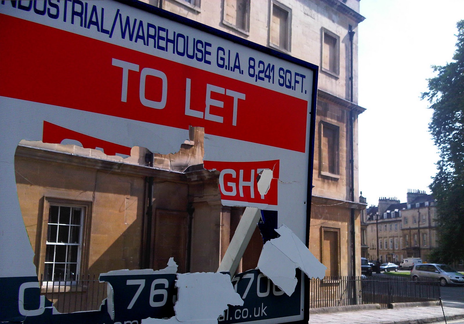
So I suppose your asking, what it an nice vintage shop doing in an industrial estate with a lovely skip across from it?

If So then good.

I took one of my photos taken from the industrial estate then i found a compatible picture from Bath. 
I cut the shop from the Bath picture out using photoshop and inserted in over the old building that was formely there. 
I then cut the original bins that are in the right corner and placed then in a new layer on top of the shop.

Save it all together and done.


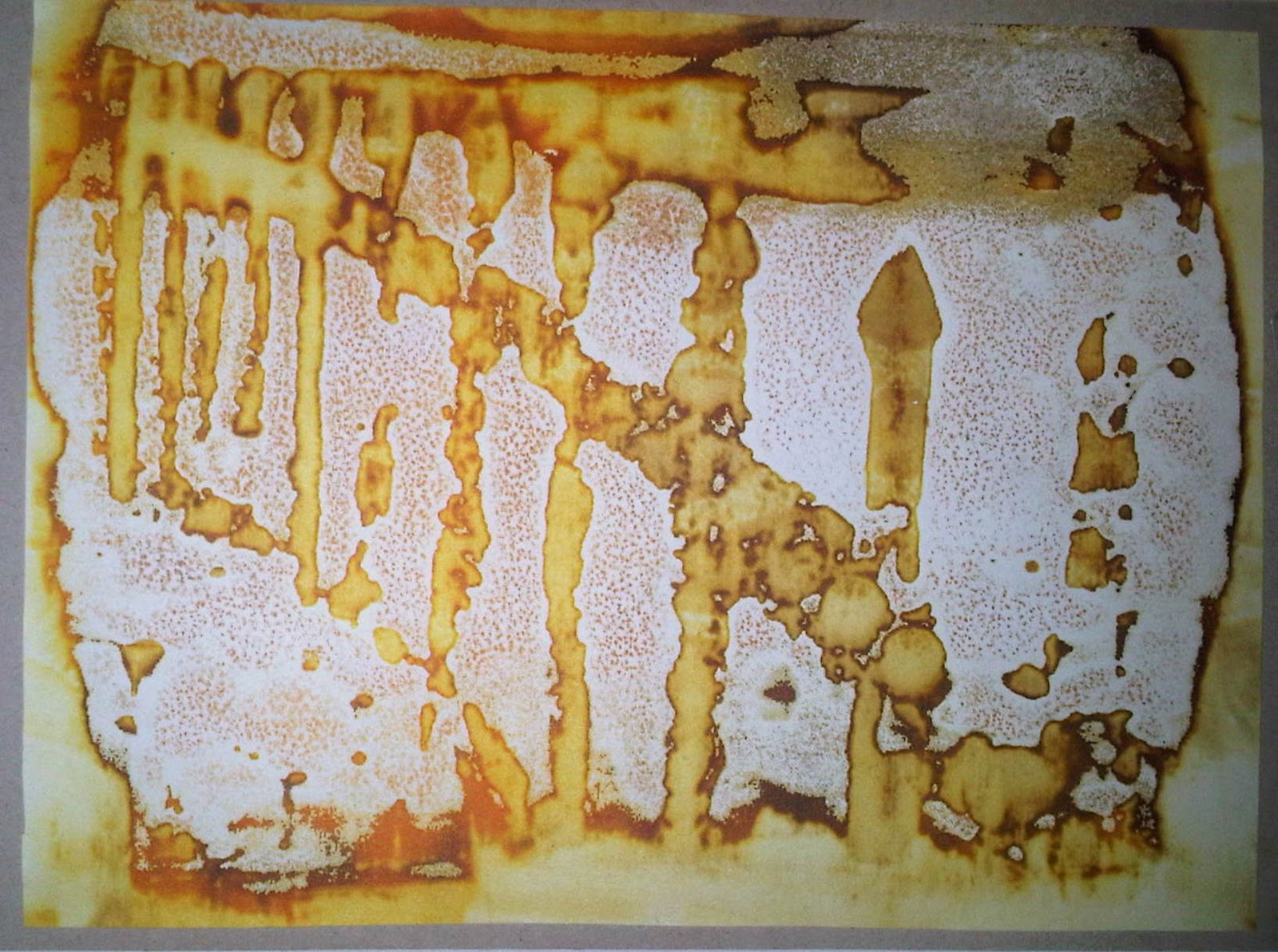
Now to draw and paint it in my own style.. 


  For this i worked onto hard wearing A2 paper. Because its on quite a big scale it took 3 days but i feel it was totally worth it and i know everything is pretty much perfectly accurate.
Ait took some time i really enjoyed it and finishing felt so rewarding.
I used Water Colour Crayons because i like the effect it has, i decided to do basic washes first and then wait until it dried to go over it in detail. I feel it is definetley something i will continue to work with.

Monday 3 January 2011

Printing Techniques: Deconstructive Screen Printing


Deconstructive Screen Printing:

I found this technique great! (Although the paste didnt smell so good). It gives off a great effect and its all about experiementing. I used thickened coloured dye on a screen and let it dry for a day. The next day i placed the materials i was using in place, popped the screen over my paper and used soda ash paste to "push" the dye off my screen and onto my paper. It works like a chemical reaction so the longer you leave the paste on the screen without pulling in off, the more dye that will be left on your paper.


Firstly i cut some cardboard to A6 size for my base. I then planned out what picture i wanted to use, because of the effect that the print gives off i decided to use a pictire from Bath as the finishing print hardly gives off the elegant effect that Bath has. so add texture i cut out the rrailings on a seperate piece of cardboard and stuck it to the A6 cardboard. I then added surfaces such as bubble wrap, wire and foil to add more layers. Once i had finished this i let it dry completly and used the thickened dye to print it with.

 
My first print is below, as you can see the first one has the least ink on, so the effect is minimal but because its quite clean cut you can see it clearly and the surfaces i used.


  My second print is below. Here the soda ash paste started to work with the dye to release it more. There is a wider range in tones and is starting to deconstruct.


My Final Print was my favourite, here the print really is decontructed and the surfaces are shown well, the range in colour helps show depth and distance.