Thursday, 6 January 2011

HUH?

The First of Many.... 


Moving on in the world with photoshop, a pain in the bum when first using it but its actually quite good when you know whats what :)

So I suppose your asking, what it an nice vintage shop doing in an industrial estate with a lovely skip across from it?

If So then good.

I took one of my photos taken from the industrial estate then i found a compatible picture from Bath. 
I cut the shop from the Bath picture out using photoshop and inserted in over the old building that was formely there. 
I then cut the original bins that are in the right corner and placed then in a new layer on top of the shop.

Save it all together and done.


Now to draw and paint it in my own style.. 


  For this i worked onto hard wearing A2 paper. Because its on quite a big scale it took 3 days but i feel it was totally worth it and i know everything is pretty much perfectly accurate.
Ait took some time i really enjoyed it and finishing felt so rewarding.
I used Water Colour Crayons because i like the effect it has, i decided to do basic washes first and then wait until it dried to go over it in detail. I feel it is definetley something i will continue to work with.

Monday, 3 January 2011

Printing Techniques: Deconstructive Screen Printing


Deconstructive Screen Printing:

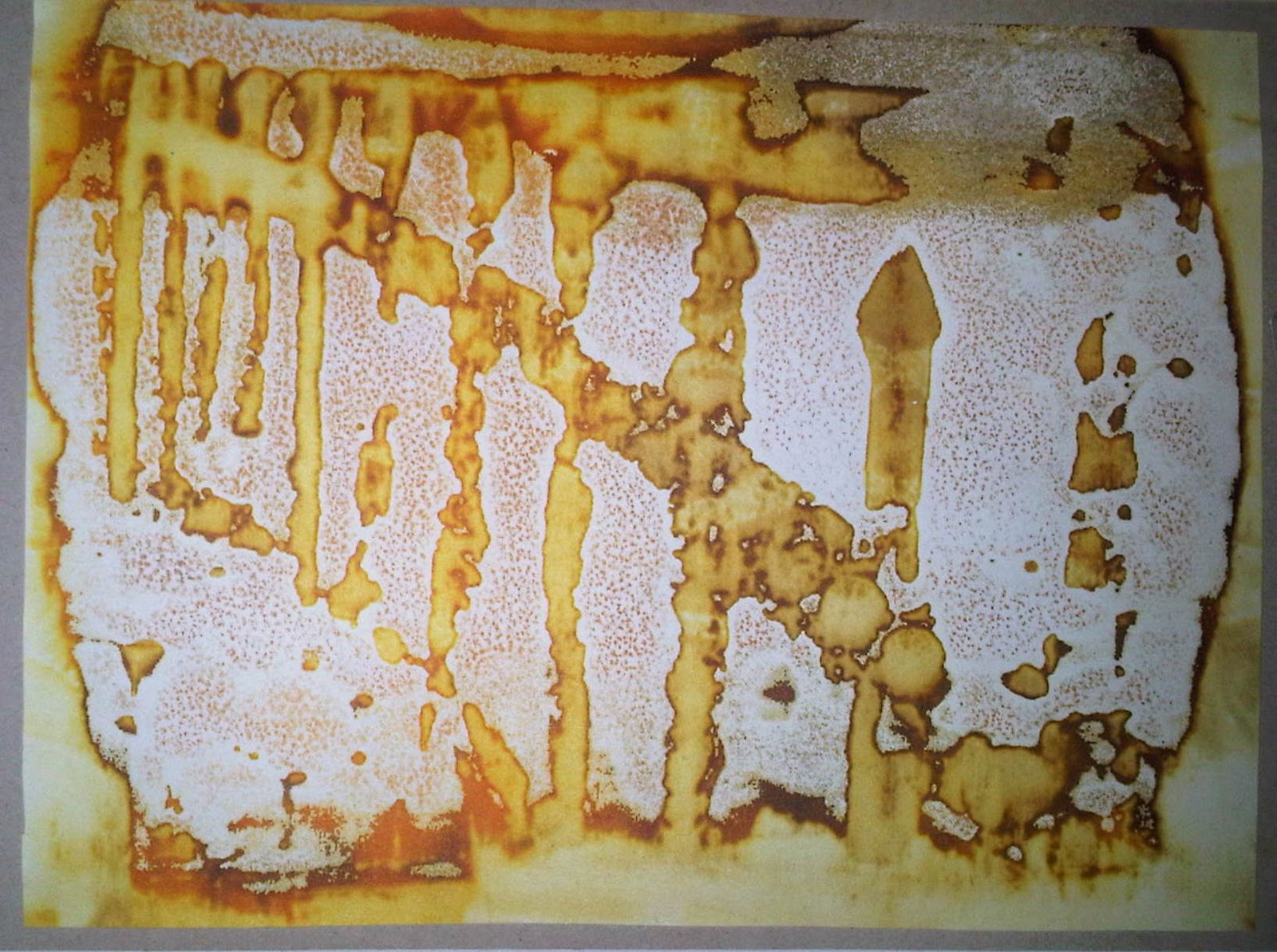
I found this technique great! (Although the paste didnt smell so good). It gives off a great effect and its all about experiementing. I used thickened coloured dye on a screen and let it dry for a day. The next day i placed the materials i was using in place, popped the screen over my paper and used soda ash paste to "push" the dye off my screen and onto my paper. It works like a chemical reaction so the longer you leave the paste on the screen without pulling in off, the more dye that will be left on your paper.


Firstly i cut some cardboard to A6 size for my base. I then planned out what picture i wanted to use, because of the effect that the print gives off i decided to use a pictire from Bath as the finishing print hardly gives off the elegant effect that Bath has. so add texture i cut out the rrailings on a seperate piece of cardboard and stuck it to the A6 cardboard. I then added surfaces such as bubble wrap, wire and foil to add more layers. Once i had finished this i let it dry completly and used the thickened dye to print it with.

 
My first print is below, as you can see the first one has the least ink on, so the effect is minimal but because its quite clean cut you can see it clearly and the surfaces i used.


  My second print is below. Here the soda ash paste started to work with the dye to release it more. There is a wider range in tones and is starting to deconstruct.


My Final Print was my favourite, here the print really is decontructed and the surfaces are shown well, the range in colour helps show depth and distance.

Thursday, 16 December 2010

Paul Ferradas

What a great photographer! Amazing portfolio on his website, You should really take a look: www.ferradasphotography.com.


Monday, 13 December 2010

Typography & Illustration

Pomme Chan

Typographer and illustrator from bangkok who relocated to the UK to study a foundation course in Graphic Design and Communication.
She has a broad range of clients from Microsoft to The Company Magazine.


Tuesday, 7 December 2010

Montage


Melinda Gibson

Below are two montages from Melinda Gibson's work. She is one of the artists participating in the new catalogue form studio Blanco. Her images are used for the communication of the project. 


Bellow are my own images that i have edited in photoshop in the style of melinda Gibson's Montages. 


Frosted.

7th December